What to look at?
for the small publication we are to choose one of the areas of design principles that we have looked at over year, these include:
Colour Theory
Layout & Grids
Figure/Grounds
Cannons
Book Definition
Typesetting
Folds
Gestalt principles
For
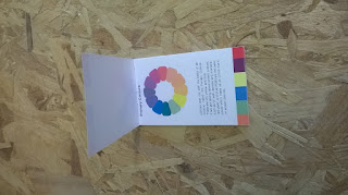
for this project, I want to make my publication small enough to be on somebody at all timed. Im a forgetful person so this would be great for me to keep on me so that i can check if I'm not sure
For me, i struggle with colour, Mainly remembering the different group names and how to acsoiate with them (last time i had my eyes tested the optician said that id need to take a colour blind test to double check). From the initial ideas I drew up, I think the japanese styled stitching one would work really well as its fit for purpose, sturdy and will look (hopefully) athletically pleasing to to the reader.
For
Aim // Initial ideas
for this project, I want to make my publication small enough to be on somebody at all timed. Im a forgetful person so this would be great for me to keep on me so that i can check if I'm not sure
For me, i struggle with colour, Mainly remembering the different group names and how to acsoiate with them (last time i had my eyes tested the optician said that id need to take a colour blind test to double check). From the initial ideas I drew up, I think the japanese styled stitching one would work really well as its fit for purpose, sturdy and will look (hopefully) athletically pleasing to to the reader.
Grid
Grid created for this small publication is only a basic one as the one be too much content on each page but has enough leeway incase we need some more information on it.


Arggh, the printer broke on us while printing it off, i dont know why but the colours all have sttripes within them which is a right pain. going to have to reprint it all off again


InDesign Mock Up
Designed the publication now, its only a small one 70mm x 125mm but i planed it to give it enough head room for a japanese stitch. Each one of these go through a different colour family set such as primary, triads, etc.
First print didn't go well


Arggh, the printer broke on us while printing it off, i dont know why but the colours all have sttripes within them which is a right pain. going to have to reprint it all off again
Final // Evaluation


Now, i think this project was over shadowed by the studio brief 2 ( the big publication) while i enjoyed it and re fought myself the japanese sticking method, i think the fact i was more focused on the second brief stopped this project reaching its full potential. The paper stock is good choice as it keeps its rigidness so it the book stays in shape. if anything, this project will be helpful for me and i guess that s what i wanted from the start.


