From designing for print to now designing for screen seemed like it would be a big jump but was actually an easier transition than expected as most of the rules for each process were roughly the same bar a few new limitations for what we could and couldn’t do and was something I was interested in working on. Since using Afteraffects in my first year of Uni, I was initially excited for what I could accomplish for this brief. From how different my first project was where I pushed everything as far as I could by my skill set, I wanted to show my capability of working with set guide lines within a brand and redesigning the self-service checkout interfaces found in Cineworld was for me a brief that would allow me to work in such a way.
Upon starting this project, Adobe released it’s new interface design software, Experience Design, which everyone found ideal for the briefs and helped creating prototypes easier. Unfortunately, as a PC user, this wasn’t made available until after the project had finished which ultimately felt like it helped me in the long run as it was something everyone was doing on the course for their individual interfaces as it was a software that was so easy to use it felt like it made people skip steps in the design process.
With working within the brand guidelines, I found it easier to come up with an outcome that would fit within any of the Cineworld locations found within the UK and make the user experience a more pleasant and easier-to-use interface that ultimately gets people into the cinema faster. With this said I feel like I was restricting what I was producing and felt like I had to stick with the norm rather than create something completely different and this left me looking back on my project with quite a bit of hindsight with what I would have done differently if these restrictions weren’t in place.
One major aspect of this was the session we had with ONLY when they came in to chat about our concepts and they seemed impressed with the problems I had identified with the current interfaces and the potential ideas I had to tackle them. The main thing I would like to take away from this project would have to be identifying a problem and creating a brief outline for it. This has to be the biggest part of any given briefs, both within Uni and outside, as problem solving is a skill that most creatives and studios look for within practitioners.
Overall, even though I feel I could have pushed myself more on this project, I am still pleased with what I have created as I believe it would be a better user experience if implemented compared with Cineworlds self-checkouts they use now. For me, this was the weaker of the two projects for this module but I wouldn’t call it a bad project as it has made me look more and more into designing for screen after University.
Tuesday, January 10, 2017
OUGD504 Design for Screen - Final Outcome
Using the mock ups, I split them down to their core elements to start animating it t get a feel for how the end product would look. through out any of the stages of buying your tickets you can insert your cineworld card to instantly grab them. with the video done, i wanted to see how a kiosk featuring this interface would look. i stumbled across this old red self service station for a Japanese hotel firm that was the right colour ans shape of what would be ideal for this UI to be featured on. If I could, i would have liked to have implemented something
similar with Amazon Go but this project is made for purely screen design. maybe this is something that i will follow up in my own time. also, the main complaint that was given when i quizzed people on their movie going experience was the fact the screen used is too small for most people and to low down for tall people. With this, i made the text and buttons larger and the screen size even bigger. This also has the benefit of having film posters around the cinema to cut down on the paper used to create the toll out ones.
Feedback:
- the fact that the posters are the main thing people see might have people who are undecided on what to watch want to see it.
- simplicity really adds to this outcome as everything is easy to use. But i think the button sizes are to large in my opinion
- with the larger screen, you can have a bunch of them in a row and all showing different film poster that you can go up to ad buy the ticket for said film!
OUGD504 Design for Screen - mock ups
For these designs, the concept behind them is to have the poster of the film as the main point. what ever the next film thats about to be shown will be the first thing on the screen to allow people to quickly buy their tickets, these follow the golden rule as the consumers eyes are guided down the screen buy the hierarchy of the poster down to the swipe up menu.
Also, im planing on having the club card implemented so that if you buy your tickets online, instead of the farce of putting your bank card in and typing in the given code you can just insert your cineworld card and type in your card. and hey presto, your you can get your tickets even faster


Also, im planing on having the club card implemented so that if you buy your tickets online, instead of the farce of putting your bank card in and typing in the given code you can just insert your cineworld card and type in your card. and hey presto, your you can get your tickets even faster


ONLY feedback
with the idea of efficientcy in mind, this has hit the nail on the head for it, being able to get a ticket in litraly a minute is great new, i spend so long trying to organise a group to get there tickets from these machines. Normaly im not a fan of having things to simplified but in this instance it works pretty well and it keeps to the brand guidelines
OUGD504 Design for Screen - Cineworld Brand Guidelines

Looking in to cineworld, the have been hiring 'Swindon Interior' to build and fit the new interiors. Swindon have also worked on cinemas such as Odeon, Everyman ect to create modern, slick interiors for most modern cinemas. With these new interiors becoming more of the norm using projectors, monitors and sleek work tops i think that for my approach to this will have to be equally as modern.
Keeping with the given guidelines of the company, I'm going to use their given colour scheme and type face which is 'VAG Rounded'.


OUGD504 Design for Screen - wire framing
for this project to be a success, this interface has to demonstrate the ease and speed with which a customer can retrieve a ticket or the relevant info for said film. to do this, the number of pages the consumer has to navigate through needs to be keep to a minimum to get the customer to his tickets the quickest way possible. with this wire frame they will only see at max 4 screens in the easiest way.


OUGD504 Design for Screen - only

- Find a way to make the design happen, despite developers
- Don’t ever offer an inferior experience
- Device agnostic
- Colour compliant
- Device agnostic
- Colour compliant
- Come up with optimum design for any device
- Make it accessible
- Distinguish what content fit with what - spacing
What will the application be used on primarily?
Phone // Desktop // Tablet // Look into brand guidelines
Research:
Who wants it, users
Target audience
Problem

Integrate brand into the project not just banged in the corner
- Make it accessible
- Distinguish what content fit with what - spacing
What will the application be used on primarily?
Phone // Desktop // Tablet // Look into brand guidelines
Research:
Who wants it, users
Target audience
Problem
Wireframing:
Mockups/Sketch out ideas
What can be done
How it works, no design just functionality
Plan and organise Test
Mockups/Sketch out ideas
What can be done
How it works, no design just functionality
Plan and organise Test
Design:
Take over mockups
Test again
Take over mockups
Test again
Front End:
Talk to developers about design

Integrate brand into the project not just banged in the corner
Monday, January 9, 2017
OUGD504 Design for Screen - Amazon go
What is Amazon Go?
Amazon Go is a new kind of store with no checkout required. Amazon have created the world’s most advanced shopping technology so you never have to wait in line. With their Walk Out Shopping experience, simply use the Amazon Go app to enter the store, take the products you want, and go! No lines, no checkout. (No, seriously.)

How does Amazon Go work?
Amazon's checkout-free shopping experience is made possible by the same types of technologies used in self-driving cars: computer vision, sensor fusion, and deep learning. Their Just Walk Out Technology automatically detects when products are taken from or returned to the shelves and keeps track of them in a virtual cart. When you’re done shopping, you can just leave the store. Shortly after, the'll charge your Amazon account and send you a receipt.
link: https://www.amazon.com/b?node=1600858901
this concept is amazing and its something that could e implemented in cinemas, to remove the ticket buying process all together
Other Resources // Research
Other Cinemas// Hyde Park
Picture House, Vue, Odeon
Train station bollards
Self-service checkouts
Automated Hotel //
restaurant =
OUGD504 Design for Screen - limitaitons
Design for screen - Coding
html - Hyper text Markup Language
css - Cascading style sheets
java -Android
javascript - Advanced effects an added interactivity
SQL - Database language // hard to use //
PHP - server based language // hard to use //
IOS - Apple Language
Ruby - Twitter
IPhone killed off Flash as it didnt suport it when it launced and made it obsoleate
SQL, PHP comunitcate between a website to a data base server. (amazon, ebay, ect.)
Java, Ios for interactive websites
design for screen nomaly means your designing for a browser
when designing fo a browser, each one has a diffent look and rules so your website could look alright on the likes of chrome then looks awful on a diffrent browser such as Edge
when something adapts to diffrent platforms its responsive screen design to have your website accesible from a laptop to a games consle to a phone
acordian, The Burger button is considered to be good practice
fontface kitstrue type faces // font based kit to download for webdesign
cant use licnsed typeface as people woul have access to download the type face through your website so you can only use free use types as their royalty free as you can be fined a heafty amount
royalty free type faces for print dosnt mean it royaltiy fre
trends
it takes 2.6 seconds for users to decide if they ar going to stay on the website
72dpi resoulution for screen - speend for the file sizes
300 dpi resoulution for print
248 dpi resoulution fot retina screens
Accesibility
THE LAW - websites have to be able to meet the needs of people with dissabilits similar to how public buildings are required to have disabled access
- all of the text on the page has to be text and not an image as it needs to be detectable by screenreaders
-have to tag images to say what they are
-bad pracrtie
Websites was limeted to 12 typefaces as they where using the types of fonts that people had on their coputers
default web font is Times but you can download webfonts for online.
OUGD504 Design for Screen - Brief
OUGD504 Design for Screen Brief
Problem
With cinema experiences
becoming more and more expensive and immersive, one aspect that halts the consumer’s
experience is buying the tickets for their select film. The self-service tills
that are at the front of most cinemas frustrate users as all they want to do is
book their tickets and head into the screen. This is especially so when people
are in a rush to get into their screen, in large groups or out on a date. This
problem relates to all the forms of checkouts at cinemas, online has it better
than the rest in terms of User Interface but it too needs work to make the
process become easier. Another problem people face is to try and show their
tickets to the check when you’ve got both your hands full of cinema snacks/drinks
and end up dropping most that expensive popcorn
Objective
The aim is to recreate the
ticket buying process to become a seamless experience for movie goers to get
into their favourite films faster and easier for the likes of cineworld. Possibly
recreate the ticket buying experience movie goer’s experience
Audience
Film buffs, students,
family’s ect. (Everyday movie goers)
Resources // Research
Other Cinemas// Hyde Park
Picture House, Vue, Odeon
Train station bollards
Self-service checkouts
Automated Hotel //
restaurant =
OUGD504 Design for Screen - Ideas
brainstorming some ideas for what interfaces to work on, there are quite a few that really interest me, VR for one but Im already doing that for the Cop module. Cineworld's self service tills are definitely one that i use quite a lot with some frustration, this one really needs updating to fit with getting people into the film as fast as possible. Then there is the non existent website for where i work that might be followed up with me actually presenting it to the managers


After talking with peers and tutors in crit sessions, Cineworlds self service tills are the one I'm going to go with for this brief.
OUGD504 Design for Screen - Starting task
For the first task of designing for screen, we where tasked, as a group, to list the different interfaces we come into contact with on our travels each day. with these we had to list the good and bad aspects of each of them. Me and my group began to realise almost all interface we could think of where never perfect and everything had more that could be done to better the users experience. after this small task, we were to find a project or a problem to look at and break its user interface and experience down to be able to further the designs our self.

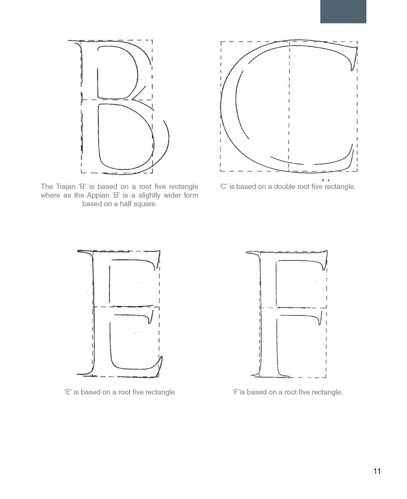
OUGD504 Type in context - Evaluation

Out of the two projects of this module, I have thoroughly enjoyed this brief as it has enabled me to develop my skills in many different areas. From pushing myself to go and visit professionals to try and break the norm of the book making process, I feel this project has really established myself as an up and coming practitioner.
One of the key points of designing this book would have to be getting in contact and visiting with Steve Roshe in Sheffield off my own back. Being able to talk with him about my ideas and getting his professional opinion on what I was doing was influential in making my design decisions for making my book. Even though my letter carving skills on that day were far from average, his input and the suggested techniques to use made the covers what they are now. The sandblasting I did for both the cover and the test pieces has opened my eyes to the resources the college has to offer and because of this they will definitely be sources I will use in the future for upcoming modules.
While I have enjoyed this project there have been various obstacles I have had to overcome to get to the final product. The main set back was being what I thought would be my final print. With both the blurred full bleed images I wasn’t aware of when making my mock ups, and the fact I was not impressed with the result of the matt paper stock used as its texture made the book look and feel cheap, it was not the quality I was looking for. The positive from this setback was it made me visit a professional print company at home which resulted in me choosing a better quality of paper for what I wanted.
While I’m happy with my outcome, if this book was to be made and produced professionally, I would have wanted to use Rockstock paper; a paper made of marble in New Zealand, as this linked in more with the content of the book. I would have loved to have used it but due to limited funds, the shipping fees were too much and they would not have got here on time. The other aspect of making the book was trying to perfect the Coptic binding method. This took a lot more attempts than I originally thought, but with the final outcome, I can confidently say it’s a method I have advanced in and would feel confident to do it again.
The main thing I would need to work on for future projects is my time management skills. At the start of my planning I was fine, but juggling different briefs as I got closer to the end of the project and trying to get bookings for different departments is something that needs working on and resulted in me not having as a completely final made outcome for the last crit with my peers.
Overall this has been the most ambiguous project I have worked on at my time at Uni and I am happy at pushing the limitations set upon us and creating something that I believe to be unique and from research hasn’t been done before, to a standard I am proud of.
I believe I achieved the goals I set for myself at the start of this brief; to create a bespoke, coffee table addition book that both designers and studios would be proud to have sitting on their desk.
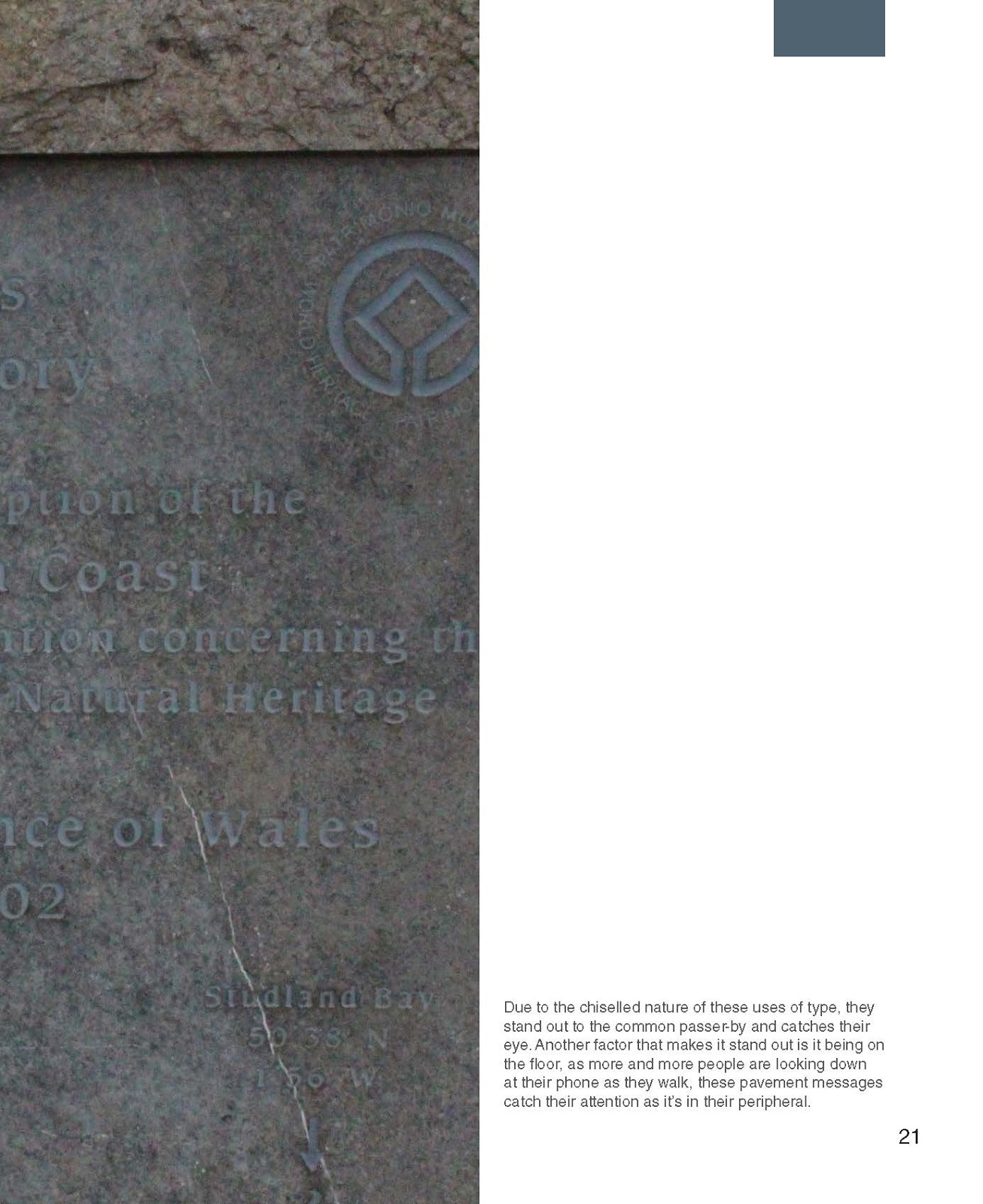
OUGD504 Type in context - Final Outcome // Photo shoot
With the layout done, I went to a local print company back home who really helped me in terms of how the book was printed. There where some set back though as the printer printed the text of backwards at first and the computer had a hard time printing the raw images used within the book so it had to be printed over night. But, now that the book is finally come together, i can happily say i am pleased with how this outcome has come out and that its definitely one of my better projects from my time at uni. I'm glad the Coptic binding has come out as it has, the loops are all in the right directions and the kettle stitches are sturdy enough for the cover

The photo shoot i used for the book was set up so the lighting is similar to that of a stone masons work shop with the obvious inclusion of stones that the book rests upon.


Feedback:
- The book has really come together. The craft thats on show with the book really showcases the content it holds.
- The binding of the slate could be tighter but other than that its really impresive
- everything is really informed and it really adds to the book as you can obviously see the work put into it
OUGD504 Type in context - New layout
After the moc up went wrong, i went back to change the faults within the book and got the new, final layout for this set in stone book. Pages 2, 4 and 6 unfortunately had to use images from the web as the images i had didn't cover what was needed,


Subscribe to:
Comments (Atom)