Layout and way finding
Creating a layout:
To give us a good idea of the space we where dealing with, I set out to find bank house to try and gage the room from the outside and the sketches of the photos provided by Danny and Simon on the briefing for this project.
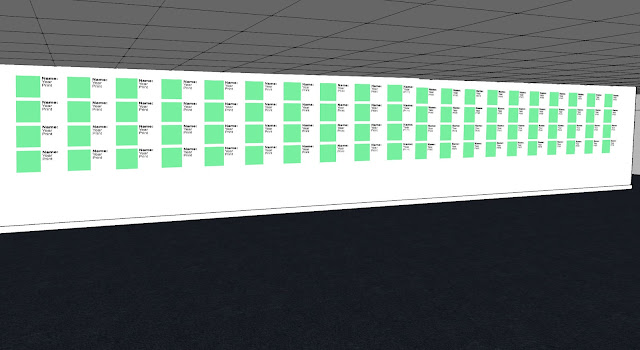
3D plan
Its crude at the moment as we've not been allowed into the space but its a pretty decent recreation from the information we've been provided. now to add the wayfinding to the space...
 |
| On the second wall, we'll have the video that tom made being projected onto it |
 |
| The video will also be played in the far conner to stop people from crowding one area |
 |
| Similar to martin parr, this will be where we display the work. next too each work will be the name, year and print method. the rest of the info will be on the guide sheet |


No comments:
Post a Comment