Friday, October 23, 2015

Logotype Evaluation

Evaluation

This was an interesting projects with the limitations of just using type for our logo designs but it was an enjoyable one. I do have to admit that being given these limitations it proved to be a little more challenging than expected but all in all it was great for learning how to use adobe illustrator effectively as it’s a program I unfortunately never really used much before. It was great seeing how everyone attacked this brief though, while my outcome had more of a simplistic approach to that of some other people’s rebrands, I think that overall it works for the company I was rebranding. Thanks to this project, I’ve been able to gain more confidence in discussing my ideas in groups and to have a go at online graphic design website such as DesignCrowd. I look forward to more projects like this in the near future to be able to further my design skills.

Logotype Applications

Menu Redesign

For the logo redesign, i wanted to re-create the restaurant’s menu so that it fits with the new logo. After going to a bunch of restaurants in and around Leeds to find out how they have done their menus I got a rough idea of what seemed to be trendy. There was a restaurant called Revelation that had their menus on wooden clipboards I was taken to that looked very trendy. This seemed to have worked quite well as the place always seem to be full of students and I thought that it fitted in with the style the rebrand was in. So, the menu has been created with the intention to keep the font style used for the logo and keeping the colour of the rebrand. For the brief I created a design for this and made the starter menu so that we can get a feel for what it might look like. If browns wanted to use this rebrand then other menus such as drinks and deserts will be in the same style.

Other Uses


Other aspects as of the company that will be redone are the uniform, napkins, cutlery and membership cards. Each of these are simple designs that use the new logo but have worked quite well. If I could go further, I think that I would like to create huge metal based logo that will be used on a wall in each of the company’s restaurant across the country. This is an idea that can be found in beefeater restaurants that is very aesthetically pleasing for when you enter them. Also, there are alot of trendy restaurants that use the logo and menus and create vinyls on the walls inside that look great. These are just some of the ways the logo can be taken further to make the company stand out more to the target audience.

Logotype Final logo

Final logo


Looking into a bit of colour theory for my Browns rebrand to see what colours would work best for the restaurant. Just from looking into what moods and messages colours can make people feel, I think the short list for the colours are: oranges which has an active & inviting feel to them, greens are cheerful and open, greys that have a cool feel to them, browns are subtle & elegant for their feeling that i want Browns to have. I settled for a darker shade of brown to give it a classy, friendly vibe to it that that brings it back to the 1970’s. With the final logo, I designed it so that it can be changed for each section of the restaurant so the ‘Bar & Brasserie’ is the main logo but sections such as the staff, food menu, and drinks menu will be able to have their own logo to make it more flexible to be used on more.


Feedback

“Colour scheme is effective for the company browns. It give me a warm and comfortable feeling to it. It’s also got a neutral tone to it so it can be suitable for lots of things. The type face used is suitable and an appealing. All of the logotype elements complement each other and is a really good rebrand for the company.”

“I believe it has succeeded in accomplishing its aims, it looks very classical and vintage. For the target audience, it looks like it fits more for a family friendly pub than a place to go for drinks. Its colour scheme works and is quite appropriate. The font used works by giving it its classical feeling to it and looks very pleasing to the eye.” 

“I think it is a very formal and suitable for the company’s setting.”

Wednesday, October 21, 2015

Logotype Development

Development


For my logo rebrand, I want it to be multipurpose so that it can be blown up or shrunk down to use it on item such as glasses, menus, cutlery ect. To do this I thought that creating it digitally would be the best way to go about making the logo to allow it to be adjusted for any purpose that might come around in the company’s future. With this in mind, I created some of the sketched up ideas using illustrator to gain a feel which logo idea works the best. There were some ideas that I didn’t like straight off the bat, the 3rd one down in the second coulomb is a clear example of that trying to combing the B and the R but that might just be that if it was worked on it could be better. Out of all of them, the 3rd one down stood out to me for its 1970 showbiz kind of feel to it which links with the company as it was founded in 1973. I’ll show my peers and get some opinions on what works.


Feedback

I took these designs to a interim crit to gain some feedback on where I was in terms of my design ideas. In the group crit the general views was that there was some really good research into the company and into the customer reviews that back up the designs. They also looked at each design and nearly everyone agreed with me that the 4th design is better than the others ideas. They said the logo that I liked the most had a welcoming look to that has a modern look to it whilst still having a friendly feeling, somebody mentioned try to use a strapline on the logo. 

This crit really helped me with which design to continue developing on and what I will need to change/add to it try to try and make it work better.

Logotype Colour

Looking into colour theory


Looking into a bit of colour theory for my Browns rebrand to see what colours would work best for the restaurant. Just from looking into what moods and messages colours can make people feel, I think the short list for the colours are: oranges which has an active & inviting feel to them, greens are cheerful and open, greys that have a cool feel to them, browns are subtle & elegant for there feeling that I want Browns to have.


Tuesday, October 20, 2015

Logo type

Existing examples

Restaurant logos.

While looking into similar style restaurants to Browns for reference, most chains have now gone for a more modern approach to their logos. Probably because its easier to see them at any size because sans serif fonts are being used. These are ideal for being shrunk to be put on the likes of menus and to be blown up for billboards. Wetherspoons logo tried to do this but the kerning of the letter spaces need to be tweaked, mainly the 'T H'. While logos such as All.Bar.One look likes the restaurant is more fancy due to its serif font, but because I want this rebrand to portray browns as a place to go with friends and family for drinks, I think I'm going to use a sans serif font for it. I also wanted to look into social places such as pubs and bars. while they where nice, i didn't think they suit brand / audience I was going for.


Pubs


Books
Vingelli's Cannon

Whilst looking into current restaurants I also started researching into existing type based logos. I also started to look into some of the books I bought over the summer such as; 100 ideas that changed Graphic Design, Logo Life, The Art of Looking Sideways, Zoom out ect to find any examples of using typography in logos, brands and images or just interesting ways typography has been used. I decided that all of these were good examples but for what I was aiming for it just didn't fit in with our modern restaurant theme.

bbc Radio 4 - the art of the menu podcast

Initial sketchs 


After creating a word bank form the vocabulary used by browns and form customers to help me gain a feeling for the restaurant, I began sketching some ideas. I was aiming for them to be more Modern, friendly and sociable with a hint of Elegance thrown in. Once done I took them over to the computer.

Monday, October 19, 2015

LogoType

Browns

For this project I have chosen to rebrand the bar & brasserie chain Browns. Not only am choosing this due it being one of the first places I went too in Leeds, but since this chain has been around since 1973 its approaching its 45th year in business. Since its logo hasn't really changed since Jeremy Mogford founded the company I feel like it's a great opportunity for the brand to be modernised to fit in with the digital age. to do this, I'm planning on looking into similar style brands such as wetherspoons, beefeater, 4grill ect. Also, after looking into customer reviews on the company, they seem to have the same sort of message... great place to go for drinks with family and friends but the food is hit and miss. With this, I'd need to create a logo that would be able to convey Browns as friendly social spot but while also trying to portray that it has great home cooked food (even if it doesn't) so I'm going to look into existing examples of British pubs and restaurants. I want this rebrand to bring the business out into the digital age with the likes of apps, online menu ordering, social media ect. I'm also going to have to take into consideration on what media the logo will be shown on. With all of this, I want to get across that browns is now a friendly, sociable and modern restaurant and I need the logo to portray this.


Word bank

- Flair
- Atmosphere
- Exeptional
- Fancy
- Expensive
- Classy
- Friendly
- Flavour
- Charming
- Satisfaction
- Finest
- Class
- Passion
- Elegant
- Social


Sunday, October 18, 2015

Study Task 02 - Symbol

Yorkshire Sculpture Park Rebrand

Brief

Our task is to design and develop a range of symbols to act as a secondary / complimentary brandmark for the Yorkshire Sculpture Park. We were urged to try and explore the use of negative space, silhouettes, angles and shape. Also try to explore the use of abstract and representational forms. A symbol should work effectively on a range of scales and should create an iconic visual signifier for a brand. Explore and evaluate a range of design treatments for a selection of different brands. 

This will help inform the direction you could investigate for our resolution. Symbols are international, there are no language barriers. However a symbol should work effectively alongside a logotype and where appropriate in isolation. 

Trip to YSP

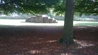
(A few images taken whilst on the trip)


Responses

Initial ideas


Digital Responses


First logo is based on the Tiki sculptor found in YSP. I wanted to go for a simplistic approach for this one and used the basic shape of the piece to create this. I was aiming for it to be able to be placed on top of photo of other sculptors. I idea that I had for it was to create a similar style symbol for each one of the sculptors  around the park but due to time restraints this was not possible but a worth while concept


This one is based around the grid outside of the entrance of the main building. The grid is made up of lots of individual words and it looks really interesting, because of this I thought it would make a great basis of a symbol design. Breaking it down to its simplest form, I started to create the outline for the logo (Top left corner image). With this, I removed the horizontal lines to create the 2 spire shapes that seem to look really interesting as they both have different sections of thickness and width. I think this logo has some great potential as when gaining tutor feedback, they stated that the piece looked really good and they could see it being used on banners and other promotional material. When showing them to the group critiques on friday, the general feedback was that this logo was much better than the other one but, the symbol looked much better without the text in it as its much more flexible.


Sunday, October 11, 2015

Finished logo and critique

Further branding and critique

Once we had the finished logo, we wanted to take it further. Crosswater itself has two other company's, Bauhaus and Simpsons, that have the same logos so we wanted to make it so our logo could be used for all 3 companies. To do this, we edited the S at the end of Bauhaus and Simpsons the same way we did the R in Crosswater to make them look like taps for the water droplet. they turned out well and you can tell they are from the same company but the Crosswater logo looks much better because it fits more. Bauhaus and Simpsons don't just sell bathroom supplies either but we thought that keeping the logos the same as the Crosswater one makes it clear that they are all connected. This can also be seen in the original logos.

Original logos:


Rebrand logos:

Now that we have the new logos, I created a mock up website for Crosswater on Adobe Dreamweaver. it isn't anything to fancy, we agreed that we liked the original website so i just re-tweaked it so that the pages font was Helvetica and moved some of the links around so it looked better. We also wanted to incorporate the colours we chose for the logs so we made the blues and greys on the page lighter so that they where the same. in the end, we were quite happy with how the new page looked, if we had more time, I would of happily worked on it more in making it functional, oh well.


On top of these, we wanted to try and make our rebrand into a flexible identity so that when they release a new range, the logo can change with it. To do this we looked at the different symbols used for there taps, especial of their new Cool Touch Valves from the Mike Pro collection. Here is some of the examples of our logo being used this way: 


Group Critique (presentation pdf)

whilst our rebrand didn't get chosen out of the 3 groups, we did get some amazing feedback from both of the tutors. They told us that we had an excellent presentation with fantastic research into our given company with some great terminology throughout. We where complimented on how broad our research was and that it was clear on where our design decisions. With the all of this positive feedback from the tutors has defiantly made us as a group and individuals feel better about our skills. considering this was our first actual critique of the year, we where complimented on how confident we where during our presentation.

On top of the tutors feedback we also got some from the groups from our presentation. Again they where mainly positive but that might just be because its our first group Crit.

Feedback from Groups

  • The idea of combining the image and the typeface together are amazing. The light colour of the logo makes people curious, because when you can't see it really clear, you want to know what it is about or what's writing on in. Nice way to attract people attention.
  • Visually interesting presentation
  • Good use of mind maps and wordbanks
  • Lots of research
  • Good use of book resources
  • Interesting idea of a 'concept'
  • Nice colour scheme
  • Really represents the brand
  • Good application on the website
  • Really good background research
  • The design of the presentation really good
  • Well spoken, was confidently done
  • Good initial research exploring the semantic field of the business section
  • In depth research was good in that you explored current designs and sourced information from a range of platforms
Overall, i have really enjoyed this weeks group project. I've got to know more people on my course, and it has pushed me to to be more confident whilst doing work in groups. Before this I dreaded working in groups after the map project but now I'm looking forward to working in groups again in the future.