Yorkshire Sculpture Park Rebrand
Brief
Our task is to design and develop a range of symbols to act as a secondary / complimentary brandmark for the Yorkshire Sculpture Park. We were urged to try and explore the use of negative space, silhouettes, angles and shape. Also try to explore the use of abstract and representational forms. A symbol should work effectively on a range of scales and should create an iconic visual signifier for a brand. Explore and evaluate a range of design treatments for a selection of different brands.
This will help inform the direction you could investigate for our resolution. Symbols are international, there are no language barriers. However a symbol should work effectively alongside a logotype and where appropriate in isolation.
Trip to YSP
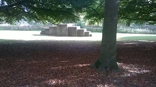
(A few images taken whilst on the trip)
Responses
Initial ideas
Digital Responses
First logo is based on the Tiki sculptor found in YSP. I wanted to go for a simplistic approach for this one and used the basic shape of the piece to create this. I was aiming for it to be able to be placed on top of photo of other sculptors. I idea that I had for it was to create a similar style symbol for each one of the sculptors around the park but due to time restraints this was not possible but a worth while concept
This one is based around the grid outside of the entrance of the main building. The grid is made up of lots of individual words and it looks really interesting, because of this I thought it would make a great basis of a symbol design. Breaking it down to its simplest form, I started to create the outline for the logo (Top left corner image). With this, I removed the horizontal lines to create the 2 spire shapes that seem to look really interesting as they both have different sections of thickness and width. I think this logo has some great potential as when gaining tutor feedback, they stated that the piece looked really good and they could see it being used on banners and other promotional material. When showing them to the group critiques on friday, the general feedback was that this logo was much better than the other one but, the symbol looked much better without the text in it as its much more flexible.


No comments:
Post a Comment