Existing examples
Restaurant logos.
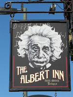
While looking into similar style restaurants to Browns for reference, most chains have now gone for a more modern approach to their logos. Probably because its easier to see them at any size because sans serif fonts are being used. These are ideal for being shrunk to be put on the likes of menus and to be blown up for billboards. Wetherspoons logo tried to do this but the kerning of the letter spaces need to be tweaked, mainly the 'T H'. While logos such as All.Bar.One look likes the restaurant is more fancy due to its serif font, but because I want this rebrand to portray browns as a place to go with friends and family for drinks, I think I'm going to use a sans serif font for it. I also wanted to look into social places such as pubs and bars. while they where nice, i didn't think they suit brand / audience I was going for.


Pubs
Books
Vingelli's Cannon
Whilst looking into current restaurants I also started researching into existing type based logos. I also started to look into some of the books I bought over the summer such as; 100 ideas that changed Graphic Design, Logo Life, The Art of Looking Sideways, Zoom out ect to find any examples of using typography in logos, brands and images or just interesting ways typography has been used. I decided that all of these were good examples but for what I was aiming for it just didn't fit in with our modern restaurant theme.
Initial sketchs
After creating a word bank form the vocabulary used by browns and form customers to help me gain a feeling for the restaurant, I began sketching some ideas. I was aiming for them to be more Modern, friendly and sociable with a hint of Elegance thrown in. Once done I took them over to the computer.


No comments:
Post a Comment